


I have chosen to do a Music magazine with the genre of 'pop'. From the top four front covers, I see that they mostly use a medium-close up shot with bright colours. For most pop magazines, the target audiences are young teenage girls at the age of 11-15.
In the first magazine front cover for 'Top of the Pops', they have used a medium close up shot of a young and pretty singer. The use of a white background contrasts and makes the model really stand out for the main image. The main colour that the magazine has used is hot pink (specifically used on the masthead), purple and white. They have done this to appeal to young girls (the target audience) who are 'girly' and like bright colours. The cover has pull quotes, a leading article and a skyline.
In the next magazine, we can see again the use of the colour pink and purple, to make this cover stand out a bit more a popular colour of yellow to capture the audiences eye. They use words in the semantic field which are associated with the target audience; such as 'pretty' and 'cute'. The word 'FREE' is also scattered across the magazine to appeal to the audience to attract the audience into buying it. Pull quotes such as 'Flat tummy tricks' are used for young girls to want to read the magazine and therefore buy it.
On the 'We love Pop' front cover, they use pink again and black. The main image is a medium shot and the colour black is used as a prop of the clothes an also for the typography. The mast head is used for all the other editions of the magazines. It is on the left side third which is a signature of the magazine for customers to recognise it and buy it again. The lead article has the name of the artist is big bold letters. This is to attract the audience as she is a pop star that most young girls aspire and look up to. There is a prop of a dog which is quite unusual but it may link in with the article. There are many sub-images in the corners of the photo. This is to show an insight of the magazine to get the consumers excited and to buy the product. There are tag words such as 'exclusive' and 'new' words to interest the audience.
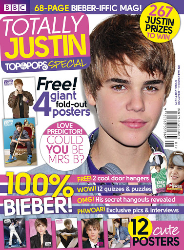
In the last magazine, the use of pink, purple, yellow and white make up the front cover. The main image shows the artist 'Justin Bieber', you can see that he has a prop of headphones around his neck. This shows the audience that this is a music magazine which is very important. At the bottom of the page, there are thumbnails which are posters featured inside the magazine, by purchasing the magazine, you will also get the posters which is a factor that the magazine has done for target audience of younger girls to purchase to put up on their bedroom walls. There are also competitions that can enter and win prizes. This is also a factor that attracts the target audience of younger girls as they are economically dependant and maybe don't have any money but with this magazines, they can win prizes that they want. They skyline doesn't use any superlatives but it attracts the reader to want to open the magazine and read it.
In all these magazines, they use the colour pink, yellow and purple. The reason why I would like to use the colour pink is because pink symbolises innocence and childishness. Pink is also mainly associated with girls and femininity. Pink is also a colour of purity and pure love. The colour purple represents royalty and therefore encourages the target audience to become loyal and keep buying the product. Yellow is the last main colour that I plan to use, this is because it shows the perspective that when you read this magazine, it will bring joy, happiness and gold. I think this is a great colour to use as it can be something that the target audience (teenage girls) can escape form the real world and enjoy themselves by reading this magazine. I can tell that these colours are very popular with younger girls who are the target audience. They also use a medium/close up shot of their artists. Another feature that they use is thumb-nails which gives an overview on what is inside the magazine. This helps the customers want to buy the product.
No comments:
Post a Comment