Monday, 31 December 2012
Contents page analysis


On the next contents page, they have something completely different with a small article written by the editor. This is unusual because most pop magazines who target teenage girls do not have this element, it is mostly used for women's magazines. Another feature is that the colour scheme is completely different with sky blue and orange. I think the use of the blue relaxes the mind and orange is a pop of colour to keep the target audience interested. Again they use thumbnails to indicate which artist/groups' article is on which page. This contents page also filled with pull quotes specifically on this page to give the audience a feel of what will be said in the interview, for example "I'd pose naked for about a hundred quid".
The two contents pages are completely different. The first page uses the traditional pink white and yellow which is used in many other magazines. However, the second page uses a different approach of sky blue and orange. I think this was done because it is unique unlike like most other pop magazines which follow the colour scheme trend. The second page uses a lot more thumbnails than the first crowding it up to burst out with information whilst the first one is more subtle and spacious. In my contents page, I will try to create a busy but also quite spacious layout so that my target audience isn't too overwhelmed by it.
Sunday, 30 December 2012
Photos from the photoshoot


Analysis of a professional photo used in a magazine
The image that is shown is inspiration of what I will plan to photograph for my photo-shoot. Although my image will be based on music, I will use props which are related to music. You can see in this photo, that there are a lot of work behind the scenes of the photo-shoot. With the big hair and dark makeup, we can see that there were lots of work towards perfecting this image. I plan to create photos on the same level as this photo. I like the lighting used in this photo because it focuses on the model and you can clearly see that there is a spot light shining on the hair on the right hand side. By doing this, it creates depth to the face and almost makes her pop out of the image. I will try to re-create this in my photo-shoot. The composition of the model is her body facing the back but her face looking towards the camera. This suggests that she is timid and shy, capturing the audience to wonder and want to know more about her. This is the effect that I wish to achieve in my work.

Saturday, 29 December 2012
Inspiration for photoshoot
I have been very inspired from these images. Most of them have white backgrounds which is what I intend to have for my photo-shoot. I will also get my model to do these poses and show her them before we take the photos. Most of these images are portrait and medium close up shots. I will also take some long shots for my double page spread.


Double page spread analysis
In this double page spread, the image is almost equivalent to the amount of text. The colours used was a white background and pink text boxes. Again the use of pink is used to show innocence and purity. The title of the double page spread is called "Taylor Tell Us". This shows the audience that when reading this, they will know about what Taylor Swift thinks and feels. This is something that the target audience want to read. The article shows smaller thumbnails which really capture the lifestyle of the artist which is what the target audience want to see. You can clearly see that in the mise-en-scene, they use a white background to focus all the attention on the artist. The costume that is used is a girly and innocent red and white shirt. They have used this to inspire younger girls to want to dress like their iconic artist which is sophisticated but also girly. This hair and makeup is subtle. The hairstyle is loose curls which fall into place whilst the makeup is light and highlighting. Lastly, the article shows pull quotes where the writing is black and bold. This gives a grasp of what the article is about and therefore interests the reader.
In the second double page spread they, again, used a larger photo taking up one whole page and also a large title. This shows that there is less content than image and title(which is actually a pull quite from the article). This is done because the target audience are young girls who don't intend to read a lot but enjoy looking at the layout and image presented. The interview consists of thumbnails and also highlighted parts. These are pull quotes which grab the attention of the target audience. The use of the white background represents innocence mixed in with the colour pink symbolising purity an love. These colours are used very often throughout pop magazines because they show femininity which is who are target audience are, teenage girls. The mise-en-scene is also a large factor of the double page spread. The costume she is wearing is symbolic to fashionistas, this insinuates that the artist had her clothes specially chosen. The stripped leggings are a huge fashion statement which targets the audience (young girls) to aspire to. The use of the camera is also a good prop because photography is a hobby that lots of teenage girls take up. They then can relate to the artists and instantly enjoy the article.
In this next article, it uses a very interesting layout which I find very inspiring. The article flows according to the main image and how it is laid out. Again the photo and the title take up a lot of the page, but in this case, the image is the largest element. The shot used is a medium shot showing the artists' whole body and enabling the view of her outfit. By doing this, it will capture the eye of teenage girls (target audience) and inspire them. Again, the colours used are pink and white, and in this case, black. The black symbolises mischievous behaviour and fun. The black really compliments the white background and bursting bright pink. The top left corner gives an insight to what the article is about. This is done so that the customers who flick through the magazine can get a general view on what the article will be about.
All these double page spreads have many things in common. These are the colour schemes, the proportion sizes of all images and the articles. But there are differences which really stand out. First of all, the shots of all images are different, this shows that there is not one standard size image to use for double page spreads, there's use of medium-close up and long shot; unlike on the front cover, most use medium-close up shot (not all). By the type of shots which are used, we can see that the long shots are trying to flaunt and show off the costumes and props.
Sunday, 23 December 2012
Mast Head Designs

This was my first mast head that I created. I used the colours pink and grey. The reason I had done this is because when comparing front covers of pop magazines that I have already seen, bright pink was a very dominant and popular colour. I then decided to use grey is because it contrasts the pink which shadows the main name. I created this mast head on Adobe Photoshop which will run across the whole of the top of the magazine. Using bright colours would only attract more young teenagers (who are my target audience). Whilst doing my market research, pink was the third favoured colour by my target audience.

On my next masthead mock-up, I used the font 'Modern No.20' because it is a modern and stylish font which look quite similar to 'Vogue' Magazine which is a very popular women's magazine. I did this because it could reflect young girls aspiring to be like their role models who read Vogue. As we know, the target audience for Vogue isn't young teenage girls but for older women. This is a young pop magazine targeted for a younger market. I have written the words 'Young Girl' in purple because in my market research, my target audience have showed me that they favour the colour purple most. from the other magazines that I have looked at, black was also a trending colour, so I decided to use that colour to stand out on bookshelves.
In my last mast head, I used the colour baby pink, I done this because once again, it was a popular colour in my market research and it was also used a lot in the popular magazines already out on the market. The reason why I used the leopard print on my mast head is because this is something that I haven't seen in other magazines. It makes my mast head very unique and therefore easier to recognise. I included the leopard print to interest young fashion girls who are interested in pop fashion, pop music and the pop industry.
My favourite mast head is the last 'Music Mag', this is because it is unique and interesting. I also found out from my market research, this was the most favoured magazine name.
Thursday, 20 December 2012
Video Questionnaire:
I questioned six young 12/13 year old girls because they are my target audience. I recorded them on the camera and uploaded them onto blogger as videos.
Research from Questionnaires

Who is your favourite artist?
Adele
Leonardo De Vinci
Beyonce
Justin Bieber x2
Rihanna
How Often do you read music magazines?
Once a week x2
Not Often x2
5 Days a week
Everyday after school
Monday, 17 December 2012
Flat Plan
.JPG)
This is my first draft of my flat plan. I plan to take a photo of a teenage girl in a medium close up shot. I used a superlative at the top of my front cover to intrigue the audience and inform them of the status of the magazine. The top right corner has a tag which quotes 'special edition', this is used to make the audience think that this specific magazine is valuable and therefore want to purchase it. From looking at my anayalsis of the other front covers of the magazines, I had realised that most of them use sub-images which is what I plan to do for the bottom right. By using the word 'FREE', it implys that there are free things in the magazines so that the audience want to buy it and consume the free gifts. There are also some pull quotes such as '3 reasons we love girls aloud'. There is also a main article pull quote of 'Interview with the new up rising Lily Malik'. By adding an artist chart list, it tells the audience that the magazine is specifically aimed at music. The left third is a 'K' as a mast head specifically to stand out over other pop music magazines, it also helps customers remember the magazine to buy it again.
.JPG)
My second flat plan I made the mast head lot smaller and specifically on the left third so that you can clearly see the logo on magazine shelves. I also intend to use a skyline that uses superlatives (for example: Most Amazing) to capture the audience into buying the product. There are also sub-images at the bottom and the left hand side. I made sure that I included a barcode also. There is language that is used to anchor the image. A way I could improve this is by making the mast head bigger so the audience can be clear that it is the name and logo of the magazine.
.JPG)
In this last flat plan for my magazine front cover, I decided to not use a skyline but use a footer instead. By using less thumbnails and more pull quotes, it may appeal less to my target audience which is what I should avoid whilst producing my final front cover. I also included a corner dedicated a glimpse of information that was included inside my magazine. For the main image, it is slight cornered to the right hand side, this leaves more space to include pull quotes and thumbnails.
Saturday, 15 December 2012
Pop Magazine Front Cover Analysis'


I have chosen to do a Music magazine with the genre of 'pop'. From the top four front covers, I see that they mostly use a medium-close up shot with bright colours. For most pop magazines, the target audiences are young teenage girls at the age of 11-15.
In the first magazine front cover for 'Top of the Pops', they have used a medium close up shot of a young and pretty singer. The use of a white background contrasts and makes the model really stand out for the main image. The main colour that the magazine has used is hot pink (specifically used on the masthead), purple and white. They have done this to appeal to young girls (the target audience) who are 'girly' and like bright colours. The cover has pull quotes, a leading article and a skyline.
In the next magazine, we can see again the use of the colour pink and purple, to make this cover stand out a bit more a popular colour of yellow to capture the audiences eye. They use words in the semantic field which are associated with the target audience; such as 'pretty' and 'cute'. The word 'FREE' is also scattered across the magazine to appeal to the audience to attract the audience into buying it. Pull quotes such as 'Flat tummy tricks' are used for young girls to want to read the magazine and therefore buy it.
On the 'We love Pop' front cover, they use pink again and black. The main image is a medium shot and the colour black is used as a prop of the clothes an also for the typography. The mast head is used for all the other editions of the magazines. It is on the left side third which is a signature of the magazine for customers to recognise it and buy it again. The lead article has the name of the artist is big bold letters. This is to attract the audience as she is a pop star that most young girls aspire and look up to. There is a prop of a dog which is quite unusual but it may link in with the article. There are many sub-images in the corners of the photo. This is to show an insight of the magazine to get the consumers excited and to buy the product. There are tag words such as 'exclusive' and 'new' words to interest the audience.
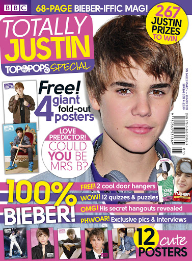
In the last magazine, the use of pink, purple, yellow and white make up the front cover. The main image shows the artist 'Justin Bieber', you can see that he has a prop of headphones around his neck. This shows the audience that this is a music magazine which is very important. At the bottom of the page, there are thumbnails which are posters featured inside the magazine, by purchasing the magazine, you will also get the posters which is a factor that the magazine has done for target audience of younger girls to purchase to put up on their bedroom walls. There are also competitions that can enter and win prizes. This is also a factor that attracts the target audience of younger girls as they are economically dependant and maybe don't have any money but with this magazines, they can win prizes that they want. They skyline doesn't use any superlatives but it attracts the reader to want to open the magazine and read it.
In all these magazines, they use the colour pink, yellow and purple. The reason why I would like to use the colour pink is because pink symbolises innocence and childishness. Pink is also mainly associated with girls and femininity. Pink is also a colour of purity and pure love. The colour purple represents royalty and therefore encourages the target audience to become loyal and keep buying the product. Yellow is the last main colour that I plan to use, this is because it shows the perspective that when you read this magazine, it will bring joy, happiness and gold. I think this is a great colour to use as it can be something that the target audience (teenage girls) can escape form the real world and enjoy themselves by reading this magazine. I can tell that these colours are very popular with younger girls who are the target audience. They also use a medium/close up shot of their artists. Another feature that they use is thumb-nails which gives an overview on what is inside the magazine. This helps the customers want to buy the product.
Wednesday, 12 December 2012
Time Table Deadlines
This is the time frame that I plan to get things finished. By adding a time frame, it will help me organise my timing of how long each task will take. By December, I plan to keep my month busy and get most preparation ready so I can make improvements with them throughout the next 3 month.
DECEMBER 2012 DIARY:
12th - Put time Frame on blog
15th - Look at other magazines or props
17th - Make some flat plans
20th -Make surveys for the magazine write up
23rd - Make a few mast heads
28th - Choose best mast head
30th - Take multiple pictures for front cover
31st - Deadline for research and planning
MARCH 2013 DIARY:
2nd - Deadline for production
22nd - Deadline for evaulation
28th - Overall Deadline
Subscribe to:
Comments (Atom)